This blog is for your comments about this website.
14 Replies to “Reflections on the website”
Leave a Reply
You must be logged in to post a comment.
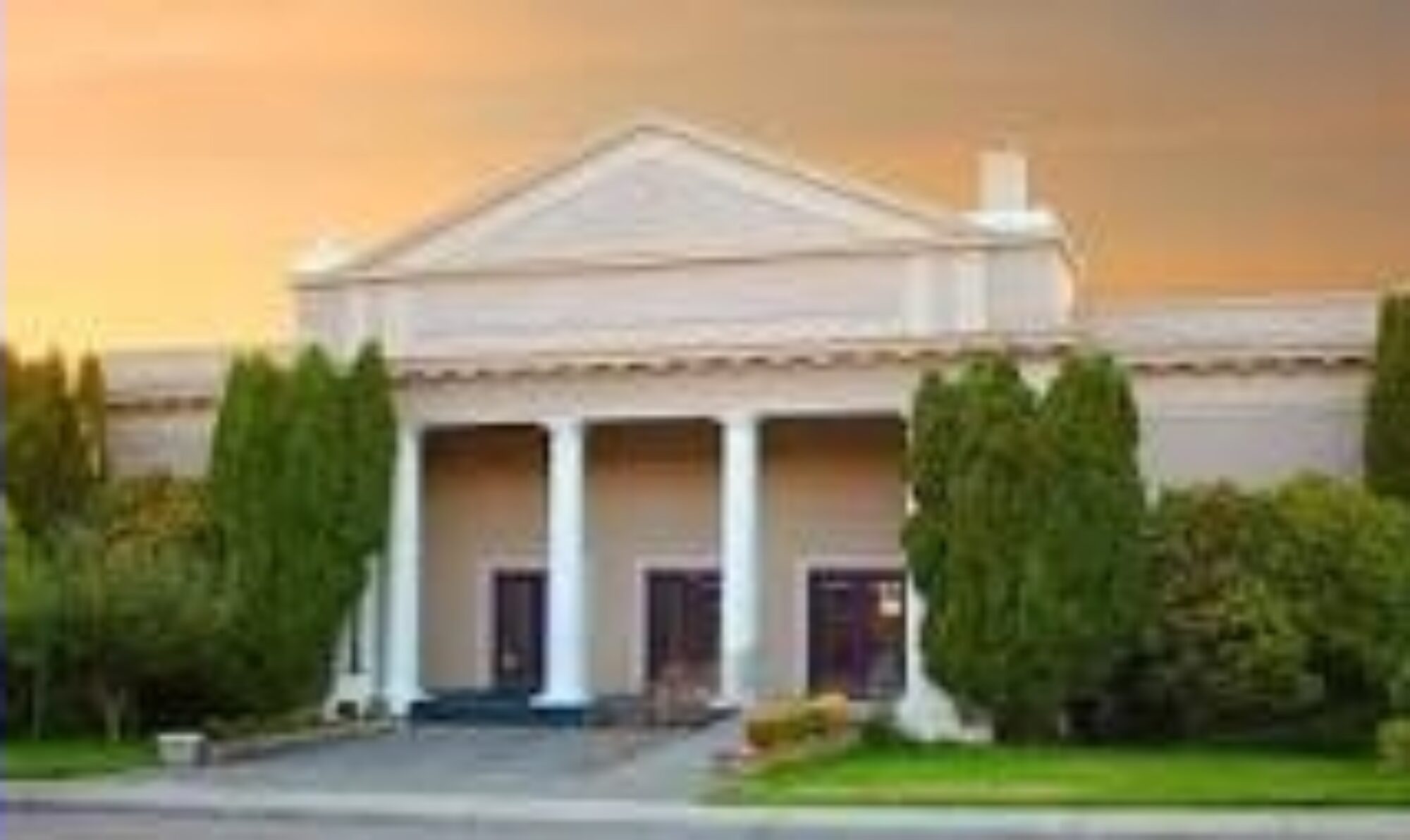
Bellingham Quakers – The Religious Society of Friends
This blog is for your comments about this website.
You must be logged in to post a comment.
far too dark, but my browser permits turning the background to white which is much more readable. unfortunately it also deletes all the images.
black is a poor choice to represent a group dedicated to finding the light. although a black background is quite faddish last several years.
Wow! This is great, John. Thank you. 🙂 It is really easy to find useful information – and it is soooo pretty!
I would change a couple of small things. Dark blue headings are difficult to discern on a black background. The light blue works well. The log-in picture of an open gate is an improvement over the previous padlock! That tree in the last sliding panel: you could find something better. Otherwise, the site is amazingly attractive, stunning in design, impressive in ease of use and filled with information that is nicely laid out and easy to access. John Hatten, you have done something remarkable with an already great site: Quaker artistry!
Looking forward to M4W4B tomorrow. Glad to see changes to website. We all move forward.
Alice
Done! Great suggestion.
One more suggestion: flip the order of Comments, so the most recent comment is at the top. 🙂
Oh – an afterthought – I know the calendar is included in the “About Us” window, but this is not an obvious place for a user to find it. I do think “About Us” should include a map to the meeting location – I.e. who, where, what information.
Then a separate window for “Calendar of Events”.
I would not put the log in window at the top of the home page – it is not clear what you need to log in for…
Suddenly I am getting ideas about how to make the site more intuitive from a user’s viewpoint. … Sorry these are so late in coming… but I do have more if it is still possible to make changes.
Judy
I would love to use this web site to check what is happening during second hour each sunday – but I can’t find that information. The metamorphosis (even if it were up to date) is way to long and difficult to navigate to obtain information in a hurry. I suggest that we add a calendar window at the top of the home page.
Thanks much,Judy
Great Website Friends! Miss attending, I am in Alabama, three friends meeting sites in the state.
Take Care
Howard Bryan
Wow this looks great! I didn’t even know it was there! I love Judy’s bright orange sweater! 🙂
Well done! Impressive, informative, attractive and fun. Pictures are always welcome. I love seeing you all, you look great!
This website is beautiful, and I feel so enriched while looking at it! Thank you, Dave and John.
Excellent job! Thank you so much. rd
Site is absolutely beautiful — and very well designed! Kudos and thanks to Dave and John! –Va.